Case study: creating a warm and welcoming office for a law firm in Texas
---
Dick Clarke + Associates creates sustainable and comfortable building for law firm Coffin Renner LLP
1. Client's needs
Coffin Renner LLP is a law firm that specializes in representing gas, electric, and telecommunication companies in regulatory proceedings in Texas. Their practice focuses on the representation of utilities before the Public Utility Commission of Texas, the Railroad Commission of Texas, and Texas courts. They have one office location in Austin, TX, and about 15 employees.
2. Goals
Before moving into their current office, the firm was renting space in a Downtown Austin high rise that was becoming too small for the team and didn’t represent the team very well. Dan Renner saw a building next to his residence (in Old West Austin) that was incredibly dated but had a lot of potential with its location opening up to the greenbelt, so he inquired to see if it would work as a new office.
The law firm wanted enough space for all of their employees to have individual offices, more conference space, a bigger break room, and direct access to the outdoors. The law partners reached out to our design team to assist with their vision to transform their new office into a fresh work environment. Dick Clark + Associates had previously converted another older building into a residence and furniture store for one of the law firm's partners.
3. Development
The existing building was dark with low ceilings but had a central courtyard that went very deep into the building that we felt had a lot of promise. This deep courtyard provided our team with an opportunity to capitalize on that extra space and bring in more natural light. We raised the courtyard roof and added skylights, which pulled more light into the interior spaces and made the entry sequence more inviting. We captured some of the courtyard with glass walls to create a central conference room and valuable square footage. Additionally, the new offices feature higher ceilings, beautiful built-in desks, and each lawyer had the opportunity to customize their office interior with wall coverings and furniture.
The existing building had no street presence, so we extended the entry sequence to the street to be more inviting, opened up the building with more windows, and warmed up the facade with texture and wood. The landscape was brought into the courtyard with planters of varying heights. On the back of the building, we removed the existing solid wall replacing it with glass, and extended a porch for private exterior space above the creek beyond.
4. Final presentation
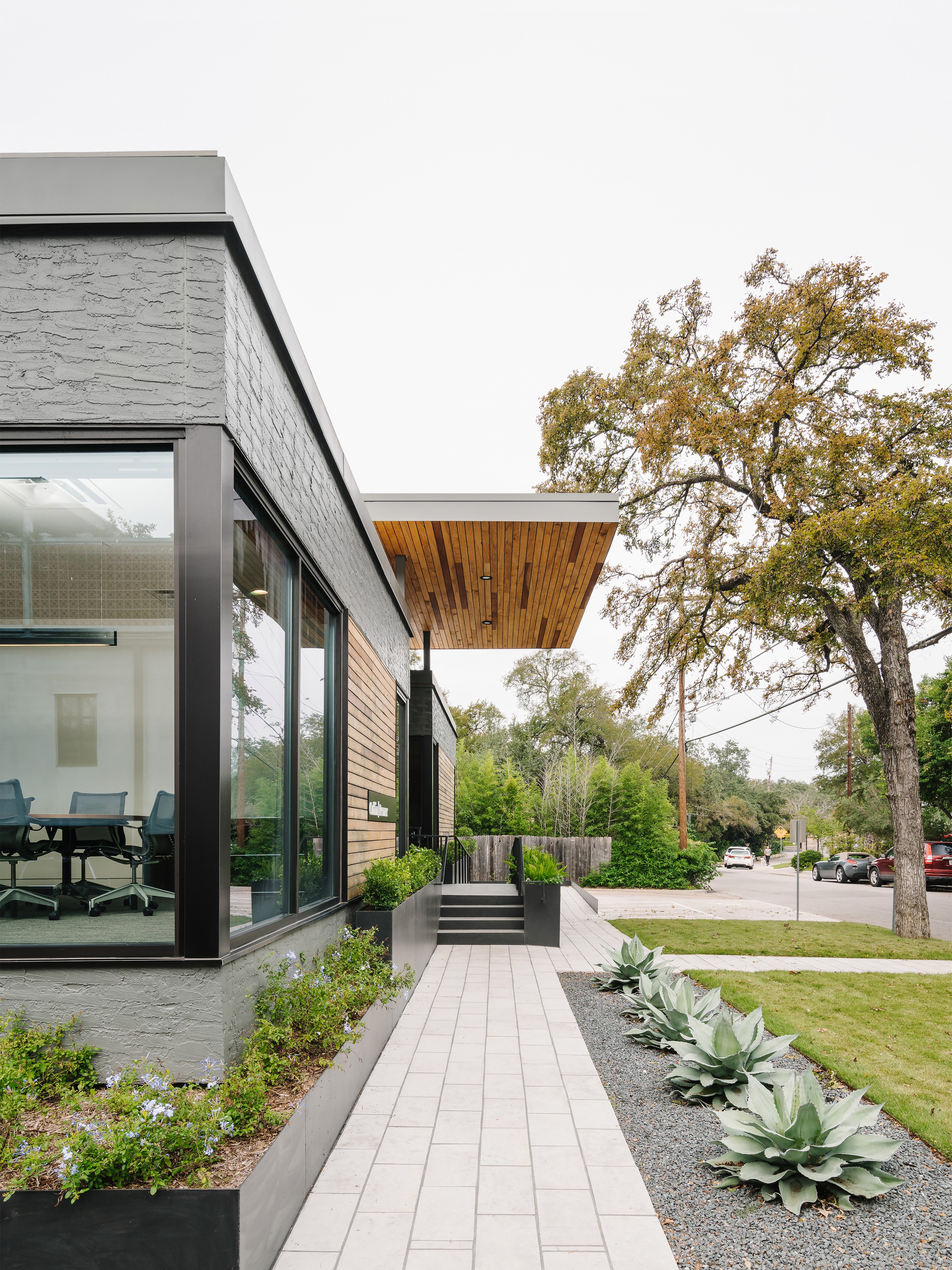 Photo: Chase Daniel
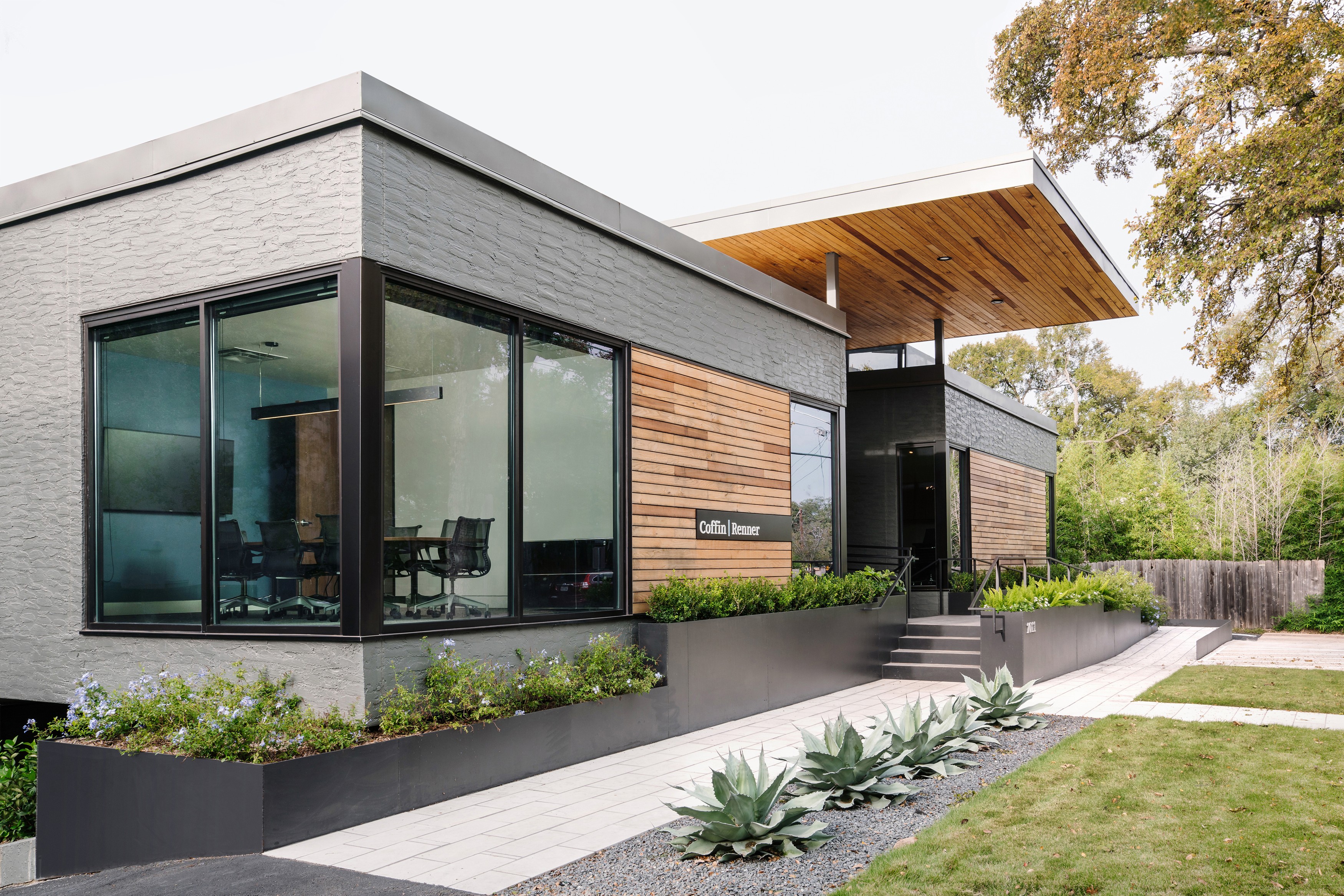 Photo: Chase Daniel
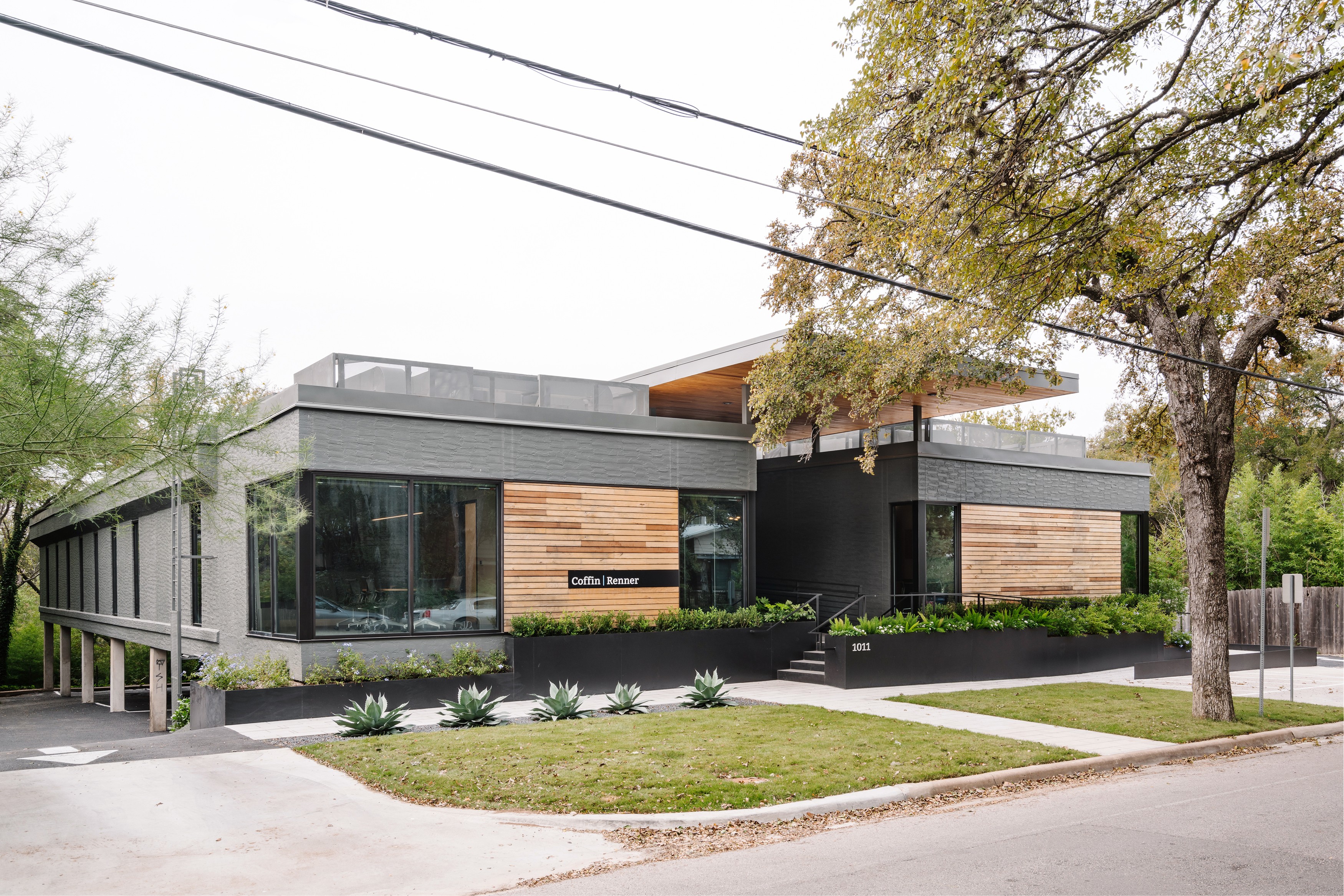 Photo: Chase Daniel
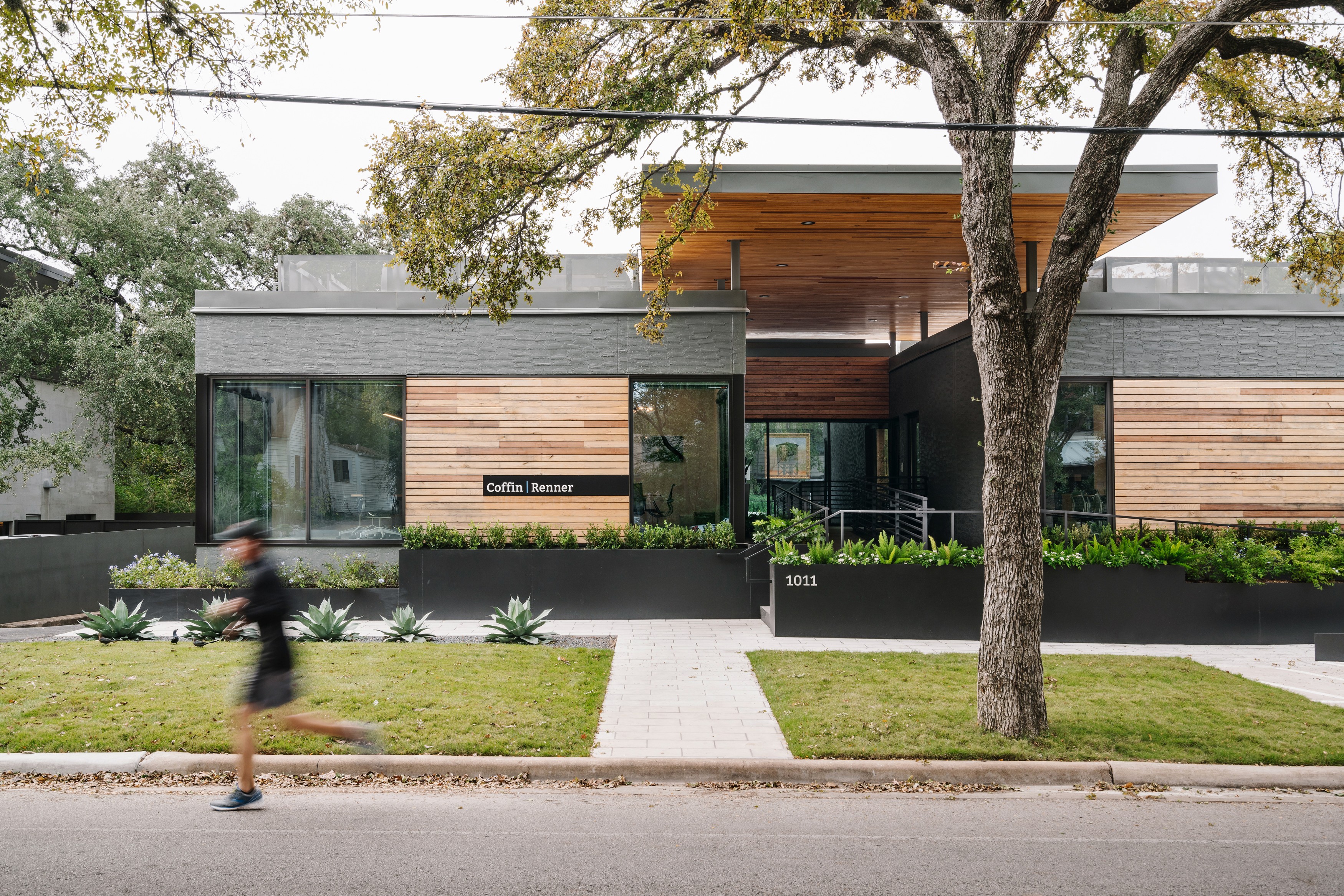 Photo: Chase Daniel
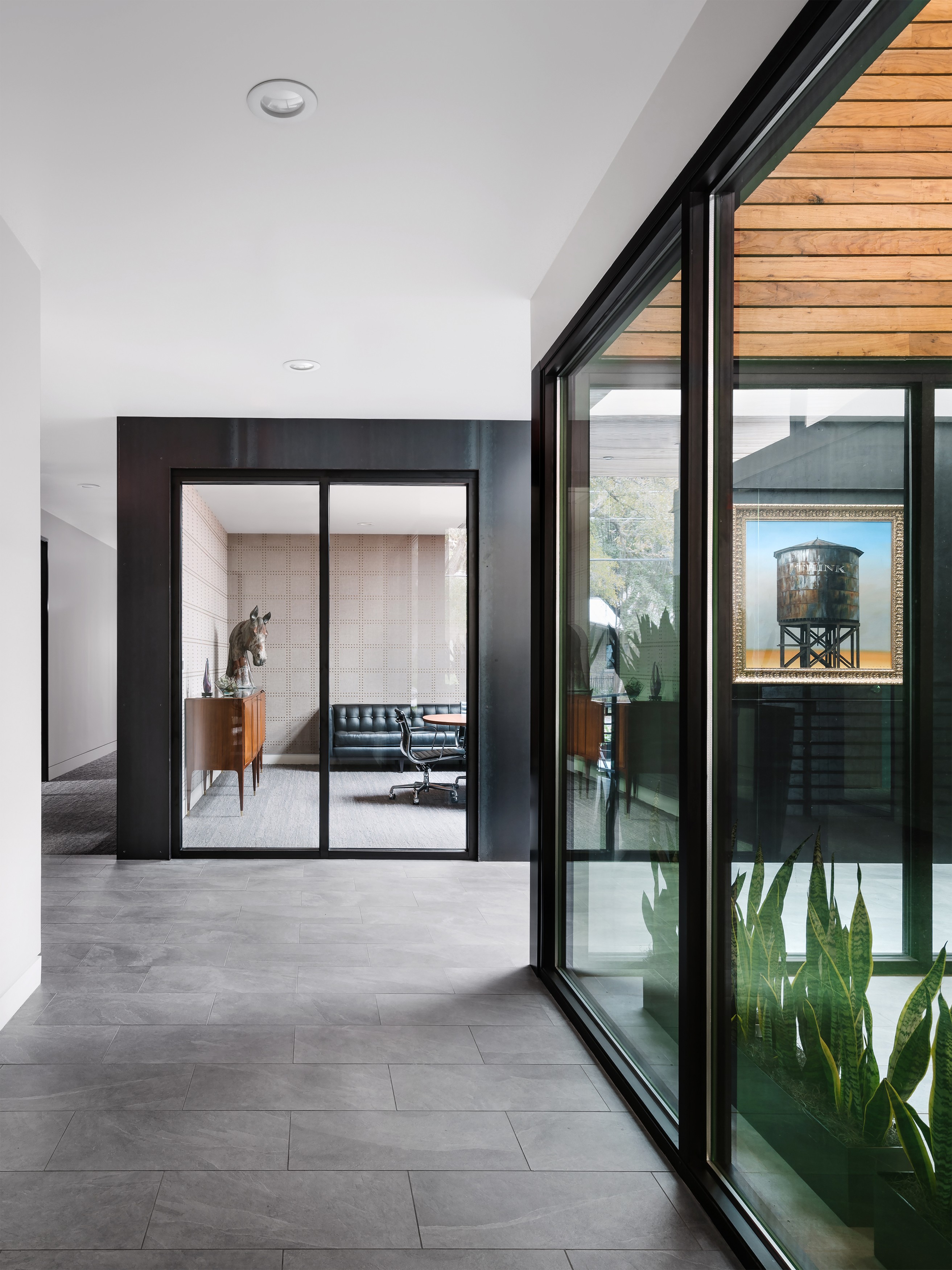 Photo: Chase Daniel
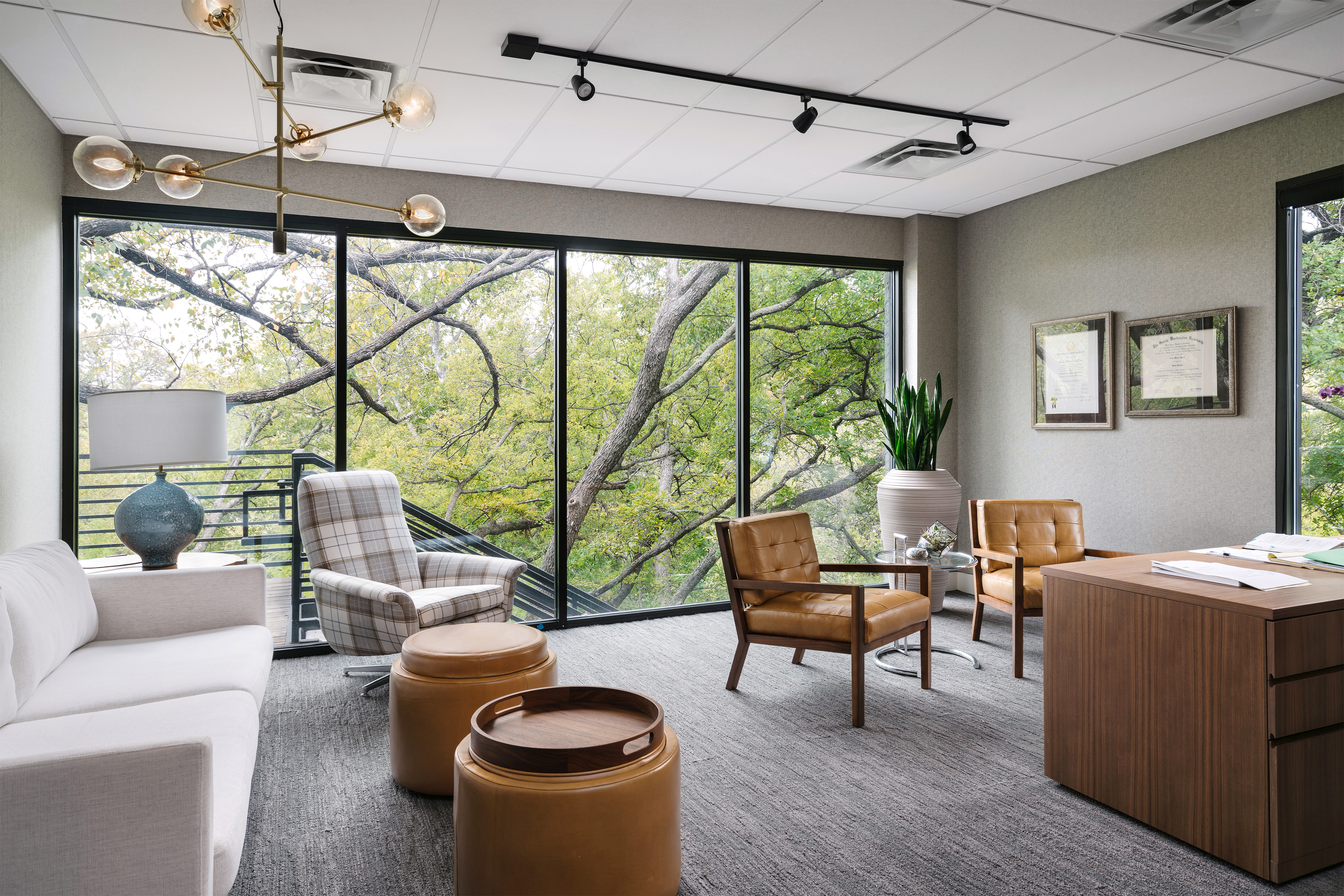 Photo: Chase Daniel
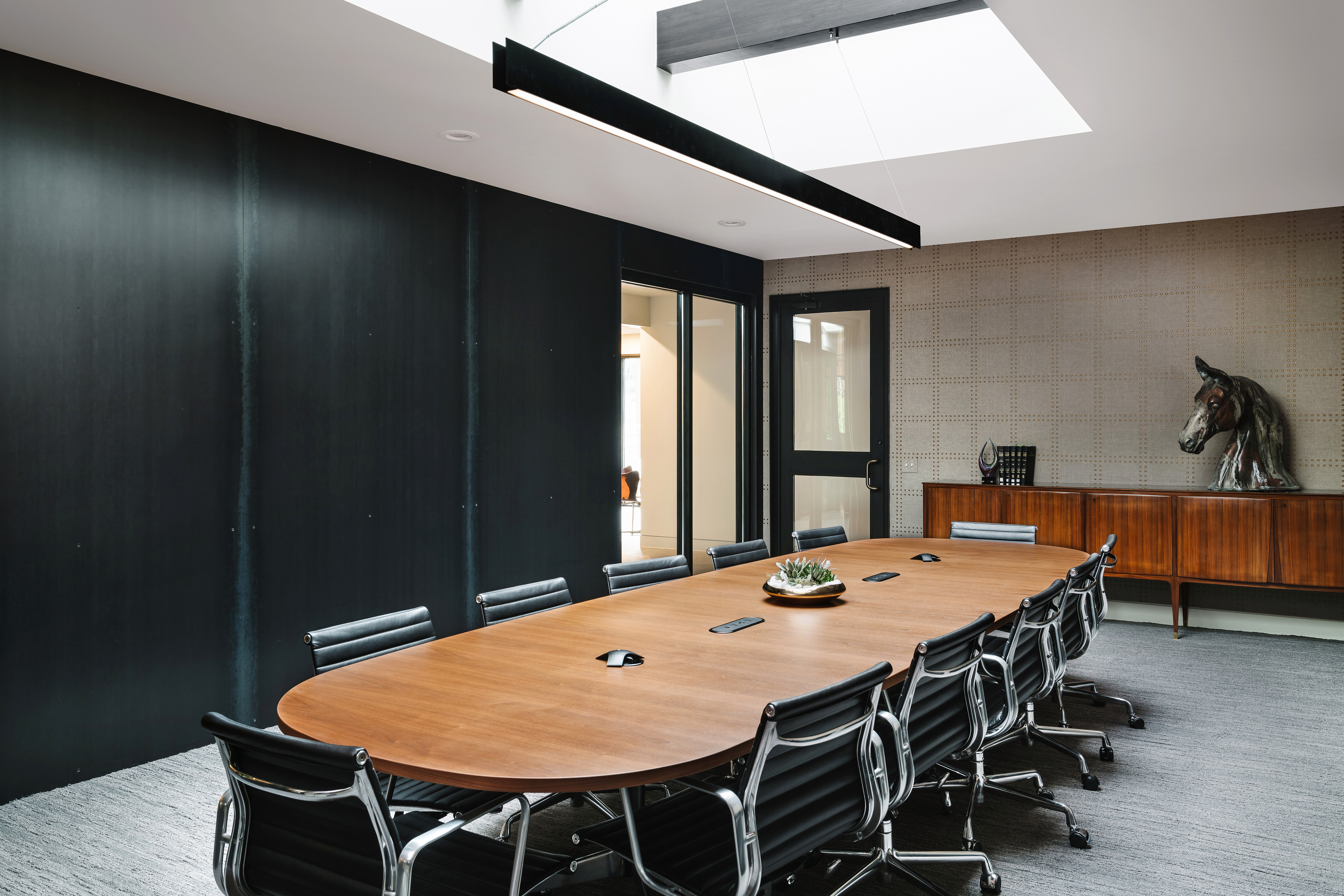 Photo: Chase Daniel
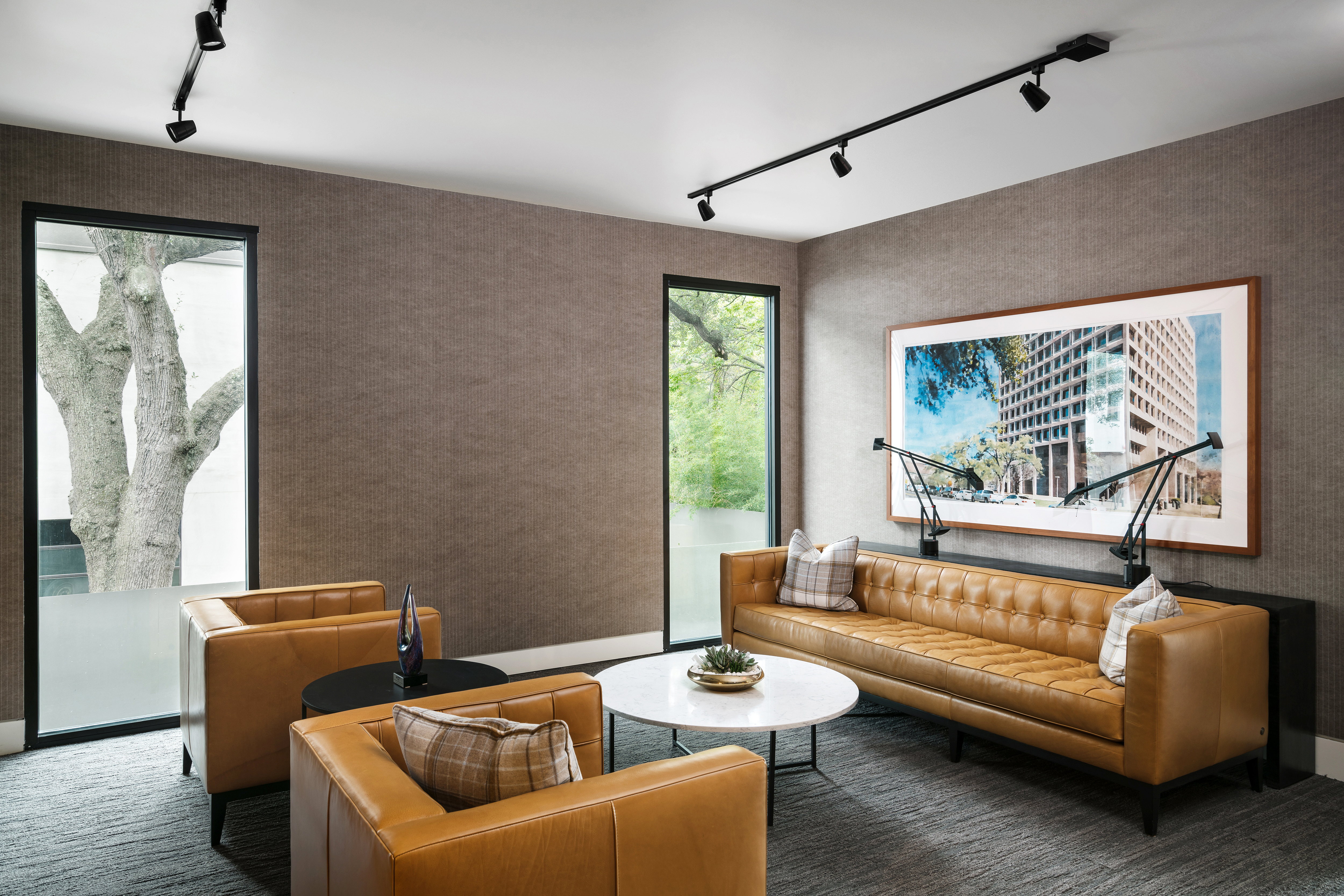 Photo: Chase Daniel
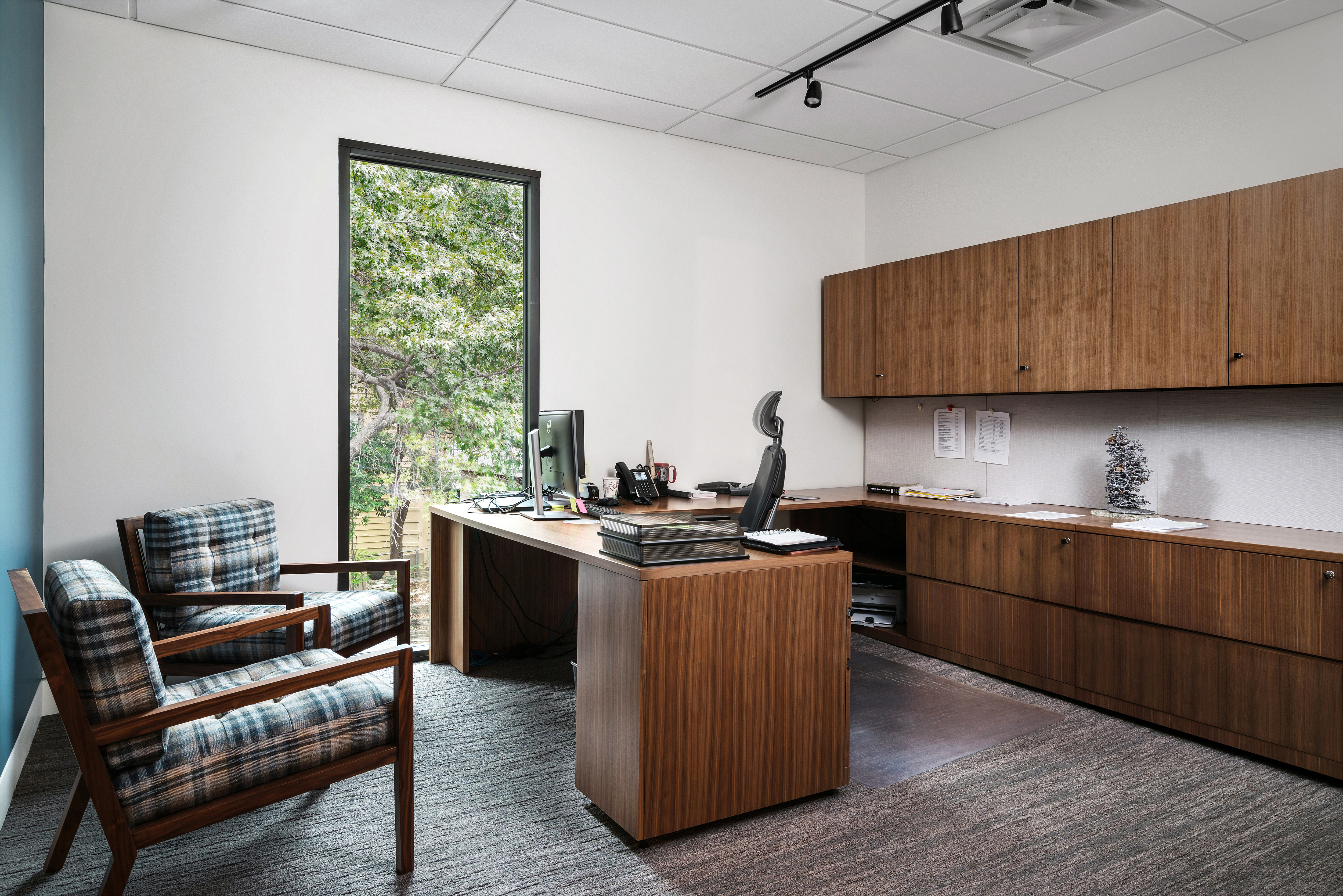 Photo: Chase Daniel
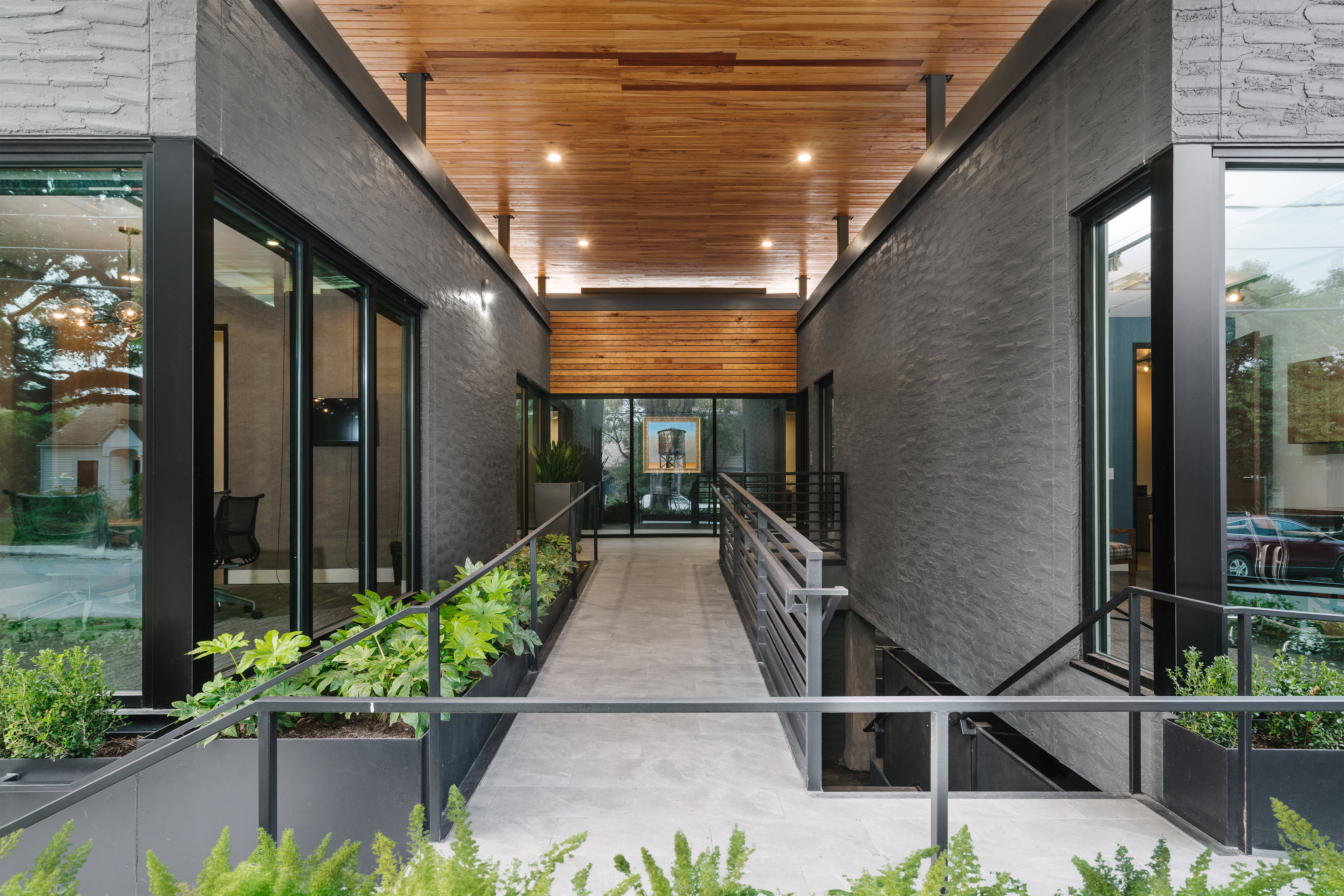 Photo: Chase Daniel
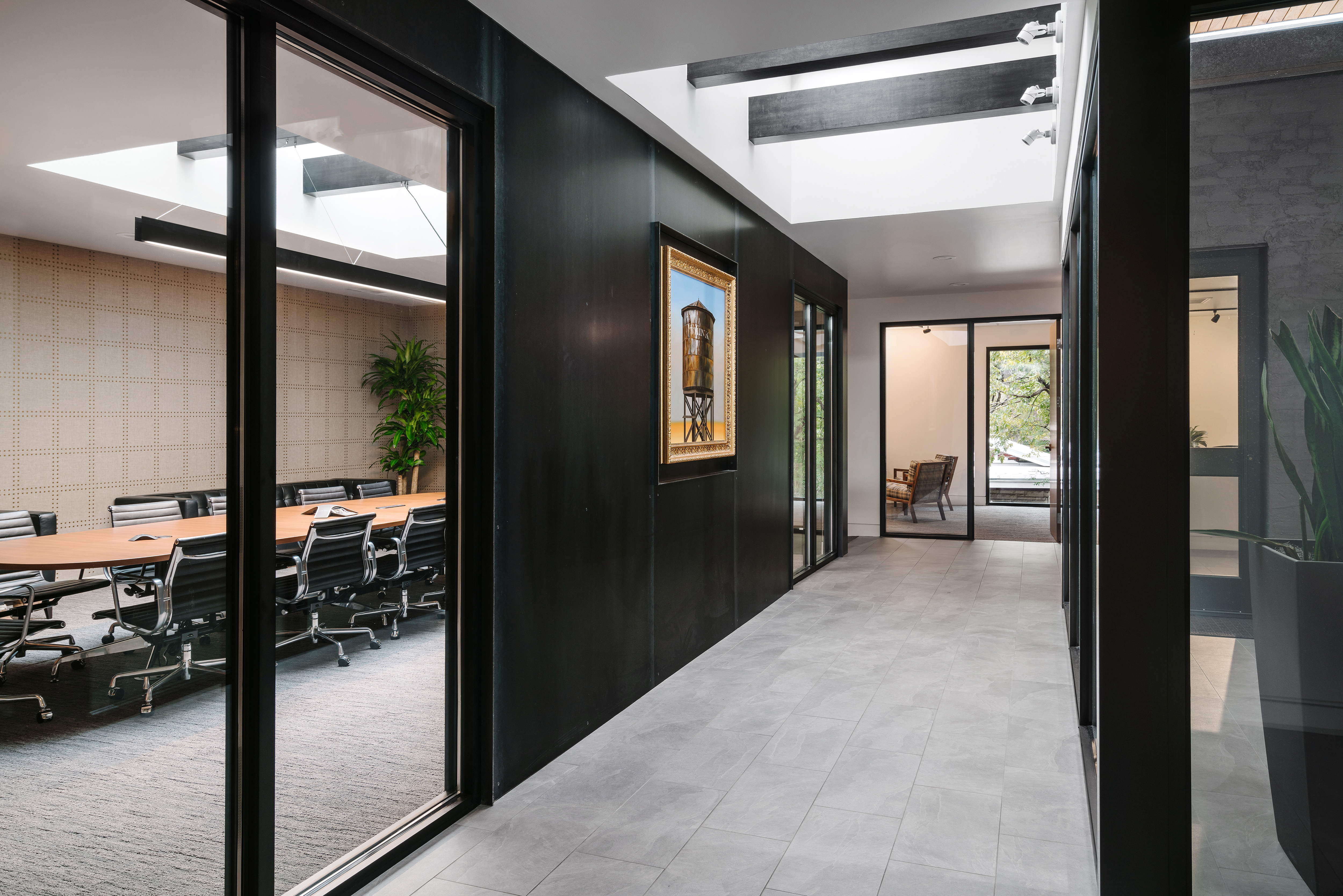 Photo: Chase Daniel
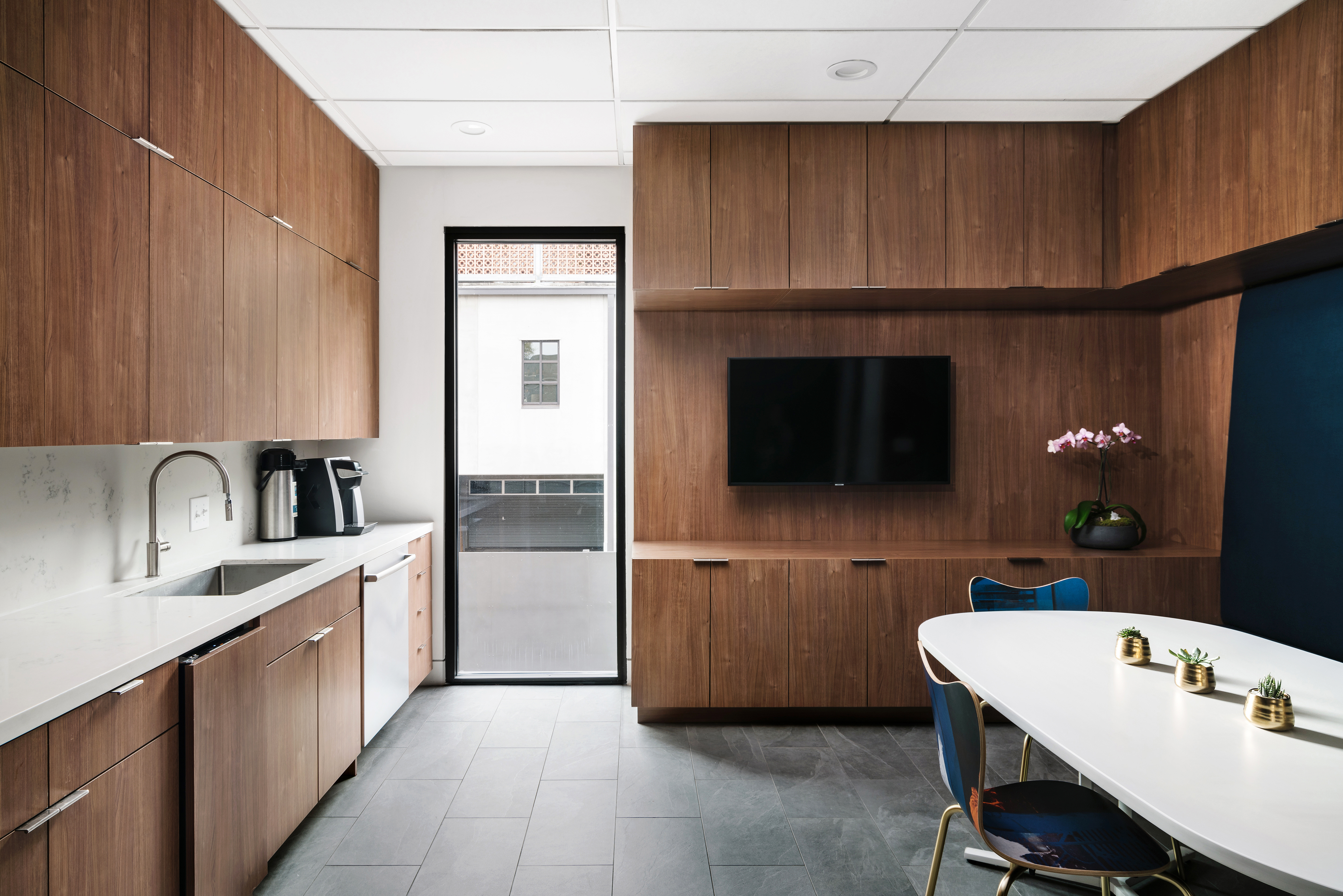 Photo: Chase Daniel
5. Benefits
Playing off of the new facade and program, steel planters of varying heights soften the building’s transition to the street and create a natural visual foreground from both the entry and the interior. By opening the interior of the building to the exterior in strategic locations, this formerly opaque building was reintroduced to the neighborhood as a warm and inviting new neighbor.
Visit Dick Clark + Associates website.
Related links
Main menu


