---
Elyssa Helfman gives you three design tips that will transform your law firm's website along with some examples
What does your website say about your firm? Your website homepage is the most important page on your website. It is your “digital first impression,” and should reflect your firm values and goals and be easily understood.
Given 15 minutes to consume content, two-thirds of people would rather read something beautifully designed than something plain. (Source: Adobe). See these statistics brought to life in the real world and see how design elements can transform a homepage.
.png)
Learn more about the design elements that transformed these law firm sites, from picking the right hero image or video, displaying a well-crafted tagline to leveraging simple and dynamic elements.
Take home
Your website homepage is the most important page on your website. It is your “digital first impression,” and should reflect your firm values and goals and be easily understood.
Full article
Design Tips That Will Transform Your Law Firm’s Website
Three Design Tips That will Transform Your Law Firm's Website: A Quick Guide with Before and Afters.
Your website homepage isn’t just about displaying information, it is your “digital first impression.” The process of designing a home page is much more complicated than just choosing pretty photos and eye-catching colors.
A great homepage should reflect your values and goals as a law firm and be easily understood. Hence why it's so important to carefully plan it out.
In our quick and easy guide, you will learn the top 3 Design elements that transform a homepage:
1. Picking the right hero image or video
2. Crafting a tagline
3. Simple and dynamic elements
Keep reading if you want to learn how to enhance your brand, communicate a clear message and promote conversions through web design.
Your Website’s Hero Banner
Whether it’s custom photography or a thoughtfully selected image, when it comes to that first image, think big. Large, stunning visuals not only make a statement they captivate users and tell a powerful story.
Custom Photography
Although 92% of marketers believe most or all of the content they create resonates as authentic with consumers, 51% of consumers say less than half of brands create content that resonates as authentic. (Stackla)
Custom photos that feature your firm’s attorneys are a great way to add authenticity to your website. Highlighting your lawyers in this way can make a difference in user perception, emotional connection, and overall impressiveness.
How much of a difference? Imagine this... the clouds part, there’s a majestic beam of light shining right on your computer screen, lady liberty is singing ever so sweetly - that’s the difference a custom photo makes.

Practice Areas: Personal Injury Trial Lawyers
New custom photos on the West Coast Trial Lawyers website showcases a standout team featuring purposeful headlines. These custom photos speak to the individual lawyers behind the firm in a fresh and modern way.
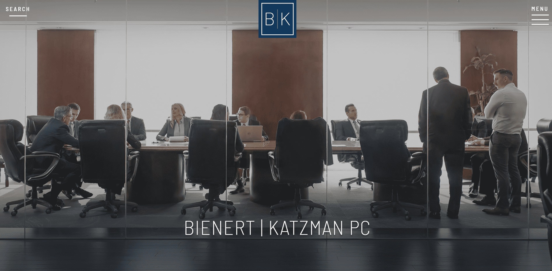
Practice Areas: White Collar Criminal Defense, Complex Civil Litigation, Last Minute Trials, Internal Investigations, Appeals, Whistleblower Claims, Bankruptcy and Restructuring
An alternative approach is to highlight the power of the firm as a whole. The boutique firm, Bienert | Katzman, used custom photos as a way to tell the story of a collaborative, dynamic and busy firm.
What’s the best piece of advice for your firm’s custom photoshoot? Choose the style before hiring a photographer and ask the photographer if they can replicate the style. From candid action shots to a posed photo shoot with your team, custom photography offers nearly limitless options.
Bold Stock Photography
When choosing a stock image for your website think outside of your literal practice area. Think about your customer and their goals. What are the pain points that have brought them to your site? When picking a stock photo, it’s all about making a statement.
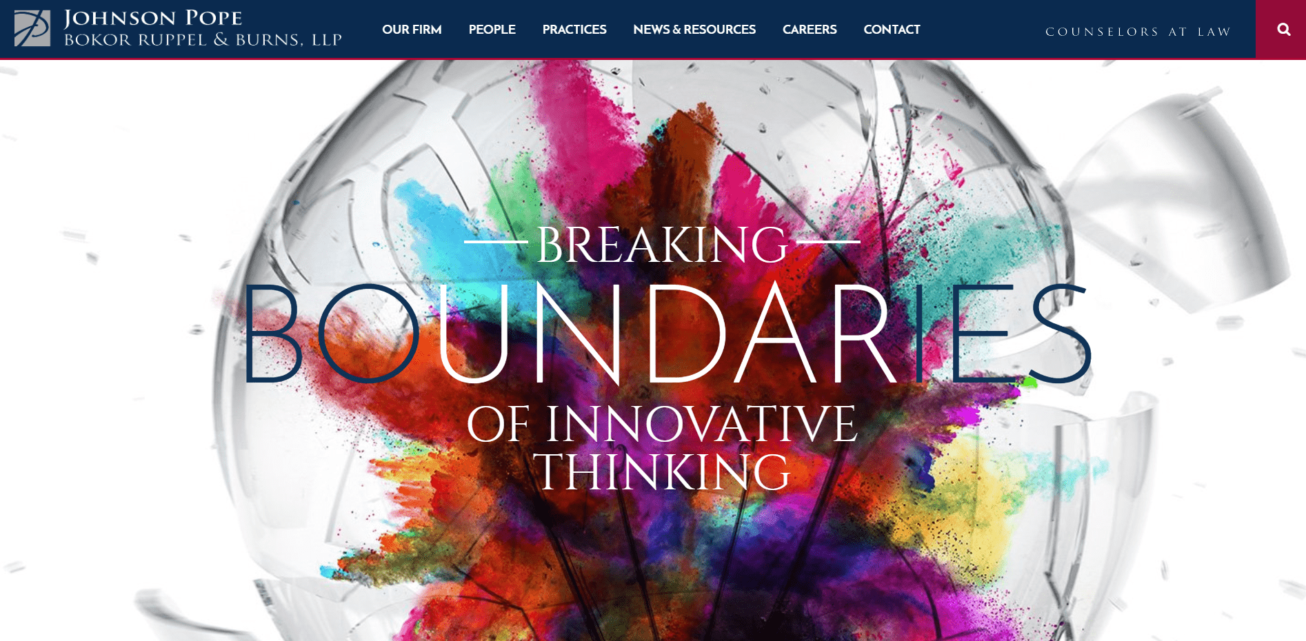
Practice Areas: Banking Law, Business Transactions, Capital Markets, Corporate Governance, Corporate Finance, Corporate Restructuring, Corporate Taxation, Corporate Transactions, Executive Compensation, Financial Services, Mergers & Acquisitions
For the Johnson Pope Bokor Ruppel & Burns LLP website, the photo tells a story. The hero image is a vivid representation of the firm’s innovative approach to law. Highlighting their value as a firm with a progressive and entrepreneurial approach to law.
Make an Impact with Whitespace
Sometimes less is more. Whitespace around images and type feels fresh, modern, and offers an overall airy clean look.
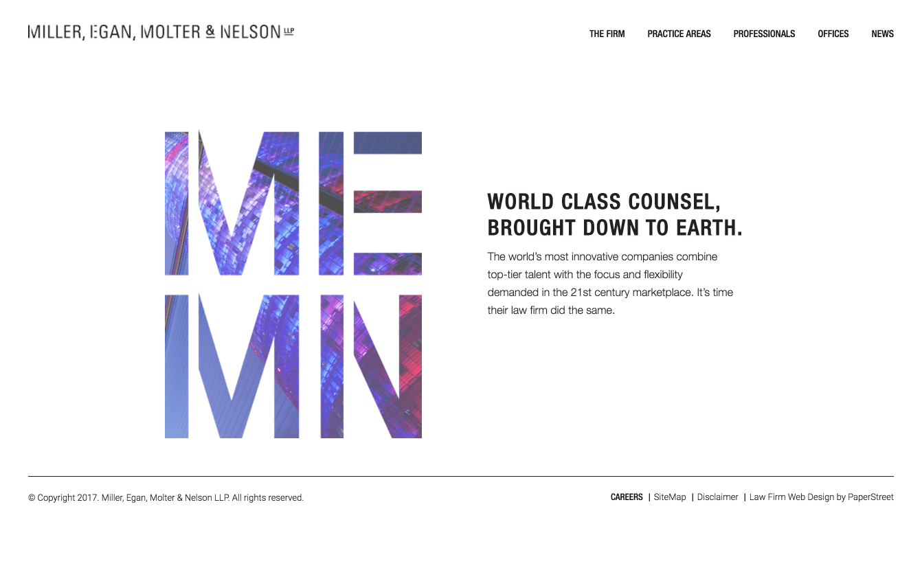
Practice Area: Business Law
The Miller Egan Molter & Nelson LLP website takes a unique approach, making use of white space to captivate the user’s attention. The succinct and powerful language positions the firm focused, innovative and modern. The clean design is the antithesis of the traditional law firm esthetic.
Clear and Concise Messaging
A short, eye-catching phrase can make all the difference. Stay away from generic sounding catch-phrases, a custom tagline allows you to address the unique needs of your clients. A clear message is a must as according to a Nielsen Consumer study, 79% of users just scan web pages. Use taglines, video, and formatting to deliver your core message in a user-friendly format.
Single Tagline
Bold text and eye catching fonts are tagline trends to watch for 2020. Keeping is short and sweet is the best way to design your homepage with speed readers in mind.
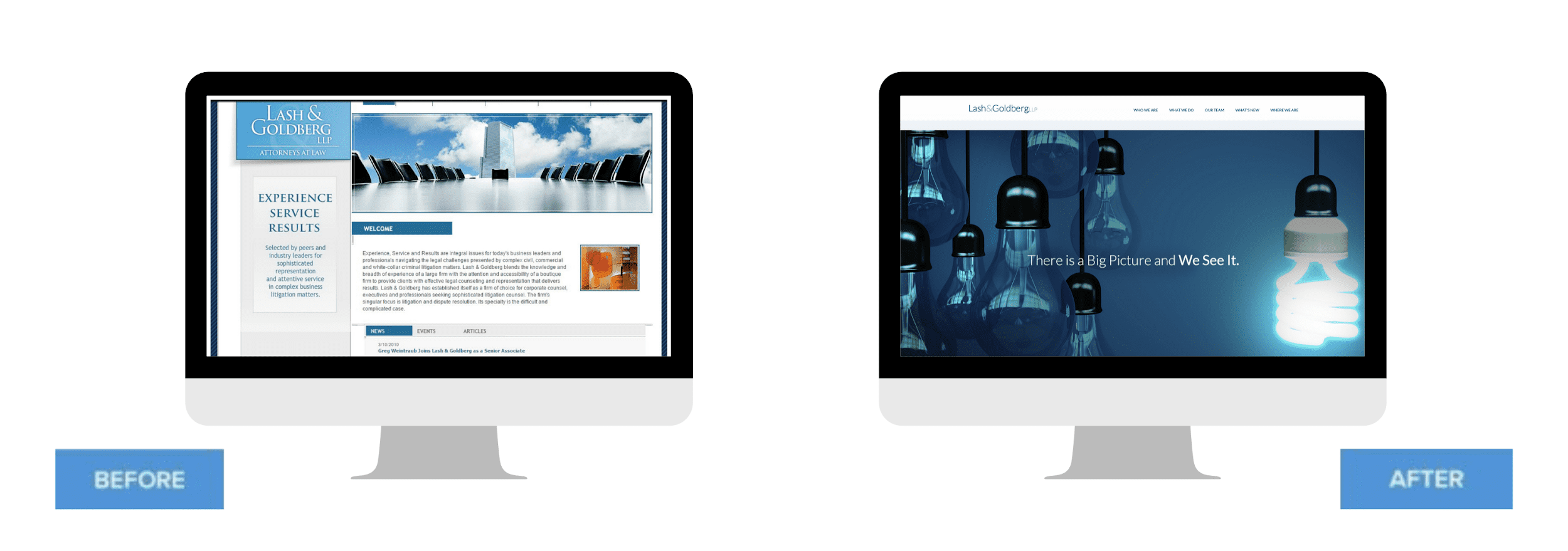
Practice Area: Complex Business Litigation
The modest yet colorful design of the Lash & Goldberg LLP allows the tagline to take center stage.The flat design seamlessly guides users from one section to the next. It’s a prime example of how to present complex information in an easy-to-digest format.
Resist the temptation to appeal to everyone and anyone with your tagline. It is better to showcase your best message, than inundate every client with multiple messages. Put all your effort into creating a single, focused message.
According to the study, published in the Journal of Business Research, there are three primary factors that determine whether people like a given slogan:
● Clarity
● Creativity
● Familiarity
The key to marketing is to be selective in what you say and having a slider with multiple messages goes against that principle. If your firm really does have multiple messages think of a way to unify them.
McFarlin LLP serves both individuals and businesses in numerous business and real estate litigation matters. The firm needed a homepage that could showcase a large list of practice areas and industries served without overwhelming prospective clients.
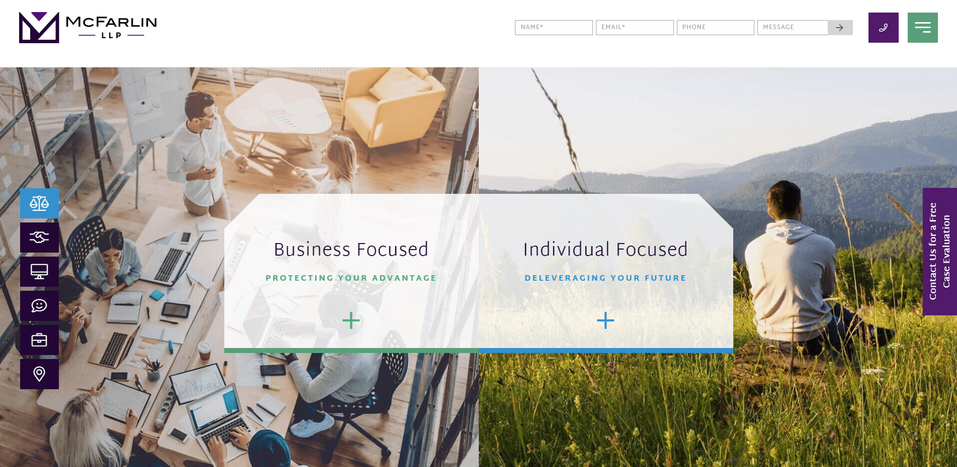
Practice Areas: Business and Real Estate Litigation
The homepage uses colorful and clickable elements to cleverly separate distinct client personas without using a never-ending slider.
Some design tricks to unify text:
● Overlapping Text and Images
● Light Drop Shadows
● Boxed Elements and Colors
Another alternative to the slider is a custom video. Video makes an impact, in fact, 80% of all consumers remember a brand video they watched in the past month. (Hubspot)
Dilworth IP supports technology visionaries through an innovative approach to intellectual property law. The website uses video to deliver a single story through the use of multiple taglines.
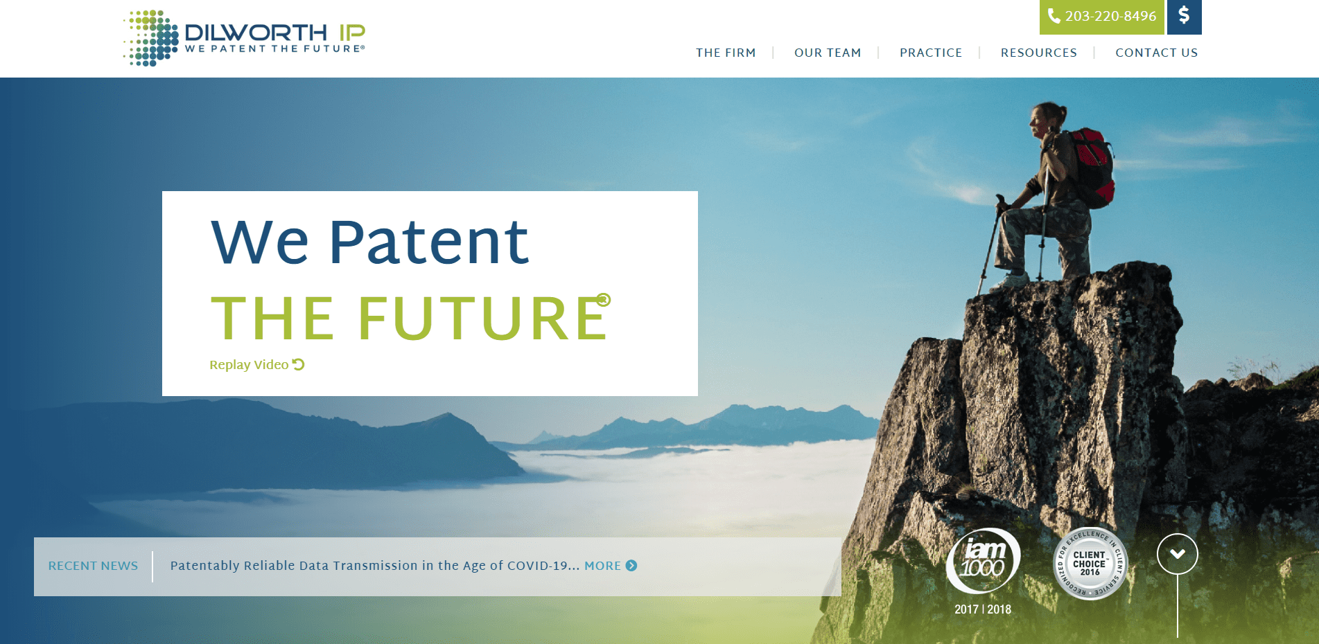
Practice Areas: Patents, Trademarks, Licenses, Copyright, Trade Secrets, Agreements
The result, compelling content that resonates with their potential client – creators of all kinds who make a better tomorrow.
Formating: The Power of Color and Typography
Flat design is still in but it’s been elevated for the likes of this coming year. One color buttons and backgrounds are still prevalent and the foundation of the design but they may be finessed with a few light gradients and design touches.
Randal Lowry & Associates is one of the most prominent family law firms in their region.
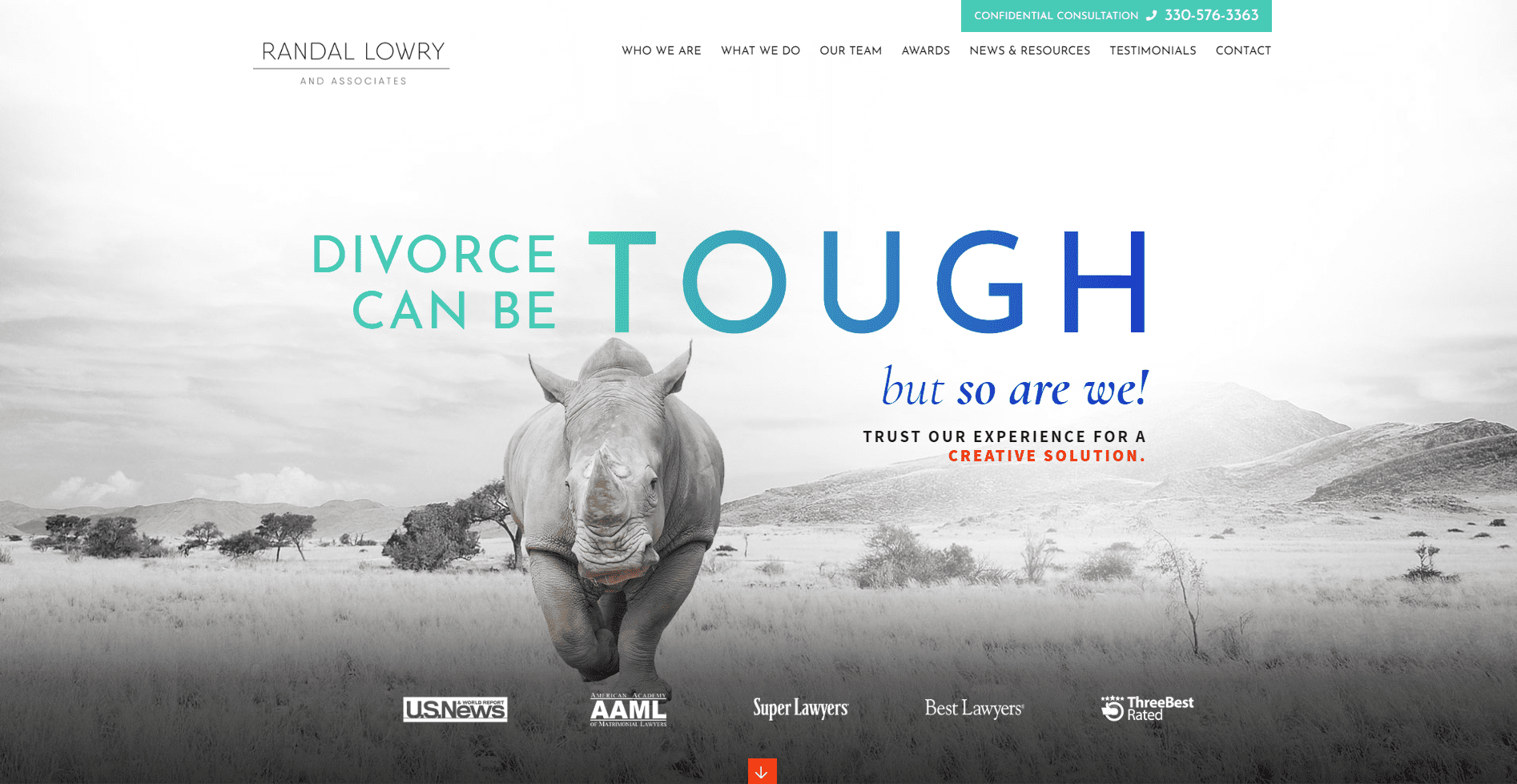
Practice Areas: Divorce and Dissolution of Marriage, Child Custody and Visitation, Property and Asset Division, Post-Divorce Enforcement and Modification, Child Support and Spousal Support, Prenuptial Agreements
The colorful typography makes the tagline “pop” off the homepage. Paired with the bold visual the color and typography choices highlight the firm’s tenacity and creativity. Choosing color and typography for your homepage is about more than just what looks nice.
Design for the User Experience
It may seem counterintuitive but, your homepage is just as much about your client as it is about your firm. A streamlined menu, easy to use calls to action, and interactive elements puts the user experience at the forefront.
Simple Main Navigation Bar
The overwhelming theme of 2020 web design is “keep it simple.” Less is more when it comes to your site’s main navigation bar. A simple main navigation bar makes for seamless website navigation, throughout the entire site.
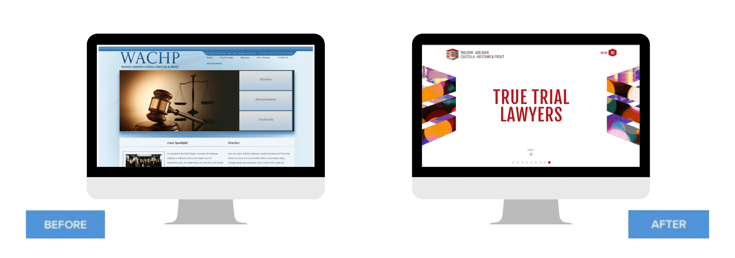
Practice Areas: ADR, Litigation, Construction, Insurance, Premises Liability, Personal Injury, Automobile
The Waldon, Adelman, Castiall, Hiestrad & Pro site uses a single “Menu” button for the ultimate minimalist approach. Color choice is also important, as Color Psychology plays an important role. HubSpot, found that a red call to action button outperformed a green call to action button by 21%.
Don’t confuse keeping it simple with making it boring. Interactive content engages users and can yield 2X the conversions of static content. Interactive elements include:
● Polls
● Surveys
● Quizzes
● Chatbots
Call to Action
Put the user first by making it easy for them to contact you. Animating or using glowing buttons and hover states to highlight a key “call-to-action”,draws the user’s eye to key areas of any page.
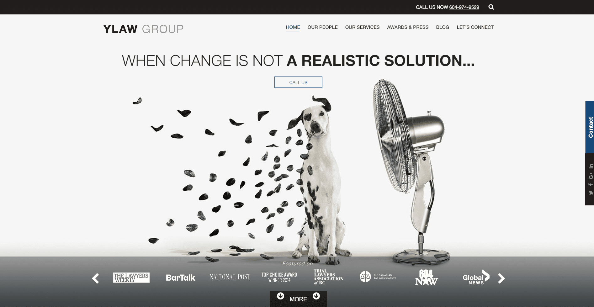
Practice Areas: Family Law, Divorce, Child Custody, Spousal Support, Child Support, Guardianship, Property Asset Division, Litigation
The call to action on the YLaw Group website is highlighted with a simple black banner at the top of the page. A sleek sidebar conceals the firm’s complete contact information form. Located just below the contact tab, an additional discreet black bar keeps social media icons organized and accessible.
Conclusion
Transform Your Law Firm Website
By refreshing your website, you not only increase the visual appeal. You can expect additional benefits from website improvements as well, including an enhanced user experience on mobile, increased security, and updated technology (chatbots, interactive maps, calendars, calculators, etc.).
Comments
Related links
Main menu


